In the digital age, a responsive website is no longer a luxury, but a necessity for physical stores. With the increase in mobile searches and the variety of devices used by consumers, offering a fluid, optimized experience on all screens can be decisive in attracting and retaining your customers.
In this article, find out why a responsive website is essential for your store and how it can boost your performance.
1. What is a responsive website?
A responsive website is designed to automatically adapt to the user's screen size. Whether your customer uses a smartphone, tablet or computer, your site adjusts to offer a fluid browsing experience, without loss of content or functionality.
Why is this important?
- Universal accessibility : Your customers can access your site on any device.
- Best referencing : Google favors mobile websites in its search results.
- Enhanced user experience : Optimized navigation reduces bounce rates and encourages action (such as in-store visits).
2. The benefits of a responsive website for your store
a. Reach your customers at any time
With a responsive site, your customers can discover your products or services even when they're on the move. A quick search on their phone can lead them to visit your store immediately after finding the information they need.
b. Improving the user experience
A site that loads slowly or is poorly adapted to mobile devices can frustrate users. A responsive website guarantees :
- Smooth navigation.
- A clear, legible layout.
- Easy-to-click buttons.
c. Boost your sales and conversions
A well-designed, mobile-friendly website can convert online visitors into physical customers. For example:
- Customers can quickly find your address and opening hours thanks to an intuitive interface.
- A well-presented promotion or new product can encourage immediate visits.
d. Strengthen your credibility
An outdated or non-mobile-friendly website can give the wrong impression of your store. Conversely, a modern, responsive site inspires confidence and reflects your company's professionalism.
3. How do you create a responsive website?
a. Choose an adaptable design
Opt for a flexible layout that automatically adapts to screen size.
b. Optimizing images and content
- Reduce image size for faster loading on mobile devices.
- Use fonts that can be read on small screens.
c. Use calls to action (CTA) visible
- Add clear buttons like "Visit us" or "Contact us".
- Make important actions easier, like finding your address or calling your store.
d. Testing your site on different devices
Make sure your site works perfectly on smartphones, tablets and computers.
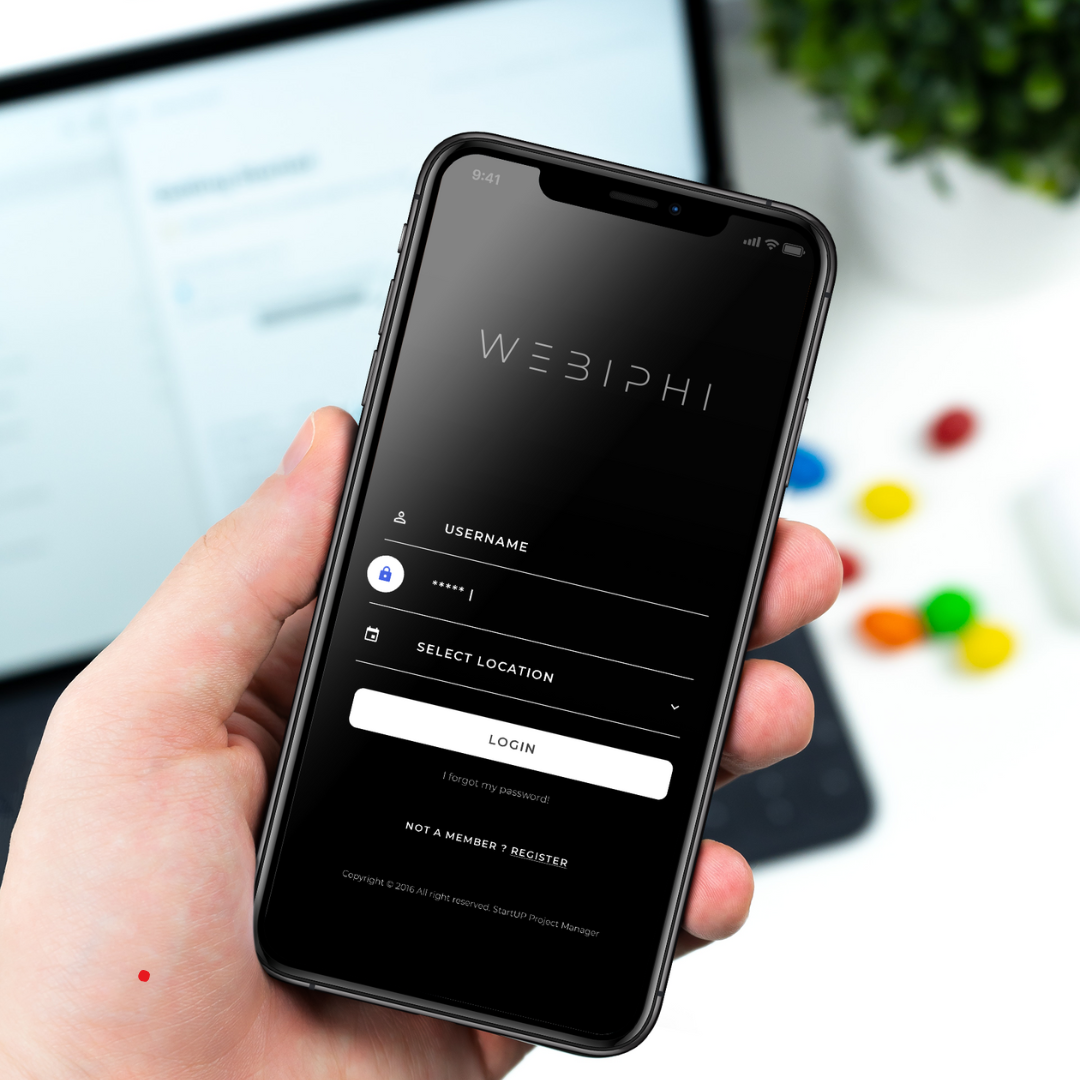
4. Why call on Webiphi for a responsive website?
At Webiphiwe understand the importance of a responsive website for your store. We offer digital solutions tailored to your specific needs, including :
- Mobile-optimized design : We create modern, fast and intuitive websites.
- Integrated local SEO : Your site is optimized to appear in local searches, attracting more nearby customers.
- Continuous support : We'll help you keep your site up to date and performing at its best.
With a responsive site designed by our experts, you'll be ready to attract customers at any time and on any device.
5. Concrete examples of a successful responsive website
Example 1: A clothing boutique in Brussels
A site with :
- A "What's new" section, clearly visible on mobile.
- An interactive map for easy store location.
- A quick contact form to reserve items.
Example 2: An artisan bakery
- An online menu optimized for small screens.
- Tempting photos of their products.
- A "Call us" button to place an order.
Conclusion
A responsive website is essential for physical stores wishing to remain competitive and attract more customers. By offering a fluid user experience and catering to customers' needs across all devices, you can turn a simple online search into an actual visit to your store.
Do you want a responsive website for your store? Call on Webiphi and benefit from a modern, fast site designed to maximize your performance!